
 Latest images
The Jersey Thread
3 posters
Page 1 of 1

The Jersey Thread
![]() TYTKyle Thu 07 Jun 2012, 6:27 pm
TYTKyle Thu 07 Jun 2012, 6:27 pm
Figured it couldn't hurt to start something separate for the sweaters, as our Canadian friends call them. A little bit of news (non-news, actually) from Justin Walden, who does a great job on his blog Shooting for the Show.
http://shootingfortheshow.wordpress.com/2012/06/07/psu-women-to-build-key-conference-rivalries-early/

Modifications:
1. Use the "Penn State" helmet, white with a single blue stripe.
2. Modify the jersey striping to match that single stripe.
3. "Chipmunk" logo patches on the shoulders.
http://shootingfortheshow.wordpress.com/2012/06/07/psu-women-to-build-key-conference-rivalries-early/
To get my long-standing opinion out of the way, I favor something like this (apologies to any and all Cornellians present):Also worth noting is that there is no date for the program’s jerseys to be unveiled, according to Matt Caracappa, Penn State’s athletic director, athletic communications.
Overall the school has done a good job of getting word out about the D-I transition. Still, it’s curious that nothing is in the works for unveiling the jerseys.
Hey, I have to be honest here. I’ve promised myself a personalized PSU jersey once I finish my dissertation this year. I know I’m not the only one with a keen interest in the jersey unveiling.
I just had to ask …
Modifications:
1. Use the "Penn State" helmet, white with a single blue stripe.
2. Modify the jersey striping to match that single stripe.
3. "Chipmunk" logo patches on the shoulders.

TYTKyle- Posts : 46
Join date : 2012-04-10
Re: The Jersey Thread
![]() TYTKyle Thu 07 Jun 2012, 6:39 pm
TYTKyle Thu 07 Jun 2012, 6:39 pm
I suppose I just as easily could have said "Cornell, except blue with the PSU helmets, shoulder patches and numbers on the front." Sorry about that. The fact that Yale's blue makes it a little easier to visualize though.
TYTKyle- Posts : 46
Join date : 2012-04-10
Re: The Jersey Thread
![]() amg424 Sun 10 Jun 2012, 1:44 am
amg424 Sun 10 Jun 2012, 1:44 am
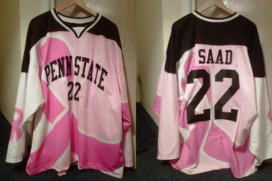
Is this like what you have in mind?

I like that look. I am not sure if I like the lion logo on the shoulders, but it has a nice, clean look to it. It is elegant in its simplicity, much like most Penn State jerseys are.
I like that look. I am not sure if I like the lion logo on the shoulders, but it has a nice, clean look to it. It is elegant in its simplicity, much like most Penn State jerseys are.

amg424- Admin
- Posts : 124
Join date : 2012-04-02 -

Re: The Jersey Thread
![]() amg424 Sun 10 Jun 2012, 2:07 am
amg424 Sun 10 Jun 2012, 2:07 am
The two ideas I have are the one mock-up that I have made that draws somewhat on what Colorado College does with their sweaters.

Here's my Penn State mock-up that resembles the CC jersey:

The second is just a return to the traditional jersey that was used in the previous varsity era at Penn State:

with changing the "PS" on the front of the sweater to the "PS" logo that is used currently on the baseball caps of the Penn State baseball teams.

Those are my ideas.
Here's my Penn State mock-up that resembles the CC jersey:
The second is just a return to the traditional jersey that was used in the previous varsity era at Penn State:
with changing the "PS" on the front of the sweater to the "PS" logo that is used currently on the baseball caps of the Penn State baseball teams.
Those are my ideas.
amg424- Admin
- Posts : 124
Join date : 2012-04-02 -
Re: The Jersey Thread
![]() TYTKyle Tue 12 Jun 2012, 3:53 am
TYTKyle Tue 12 Jun 2012, 3:53 am
Great job putting that together! Something like that, or take the number off the front and stack the words like on Joe Battista's jersey. Or do it arch style, either with or without the numbers. FWIW, I forgot I had this until now:
If the striping on the original idea is overkill, maybe just replace the black with blue and the pink with white. It's a pretty fine line to walk though - as much as I love Cornell's and Maine's and Wisconsin's style (all of which, to me, are the way college hockey should look), I still want to be "Penn State," not "Cornell, except blue."
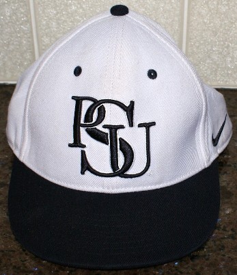
Maybe the throw-as-far-as-we-can-go-back is the right idea. Although to be brutally honest, I'm not huge on "PS" without the "U." Even as a Penn Stater, I think "postscript." Here's the old PSU baseball hat:
I don't really like the font, but something along those lines with the letters from the current baseball hat or the John Dufford special would be quite classy. Keep everything else the same. Maybe except those socks, if that's okay with you guys haha.
Really though, I wouldn't complain about anything in this thread so far.
If the striping on the original idea is overkill, maybe just replace the black with blue and the pink with white. It's a pretty fine line to walk though - as much as I love Cornell's and Maine's and Wisconsin's style (all of which, to me, are the way college hockey should look), I still want to be "Penn State," not "Cornell, except blue."
Maybe the throw-as-far-as-we-can-go-back is the right idea. Although to be brutally honest, I'm not huge on "PS" without the "U." Even as a Penn Stater, I think "postscript." Here's the old PSU baseball hat:
I don't really like the font, but something along those lines with the letters from the current baseball hat or the John Dufford special would be quite classy. Keep everything else the same. Maybe except those socks, if that's okay with you guys haha.
Really though, I wouldn't complain about anything in this thread so far.
TYTKyle- Posts : 46
Join date : 2012-04-10
Re: The Jersey Thread
![]() amg424 Tue 12 Jun 2012, 10:43 am
amg424 Tue 12 Jun 2012, 10:43 am
TYTKyle wrote:Great job putting that together! Something like that, or take the number off the front and stack the words like on Joe Battista's jersey. Or do it arch style, either with or without the numbers.
I actually like the arched letters. I was trying to do that on the jersey, but I have limited technology skills at my disposal. Haha Also, I was thinking that Battista's jersey is a good one to copy/emulate.
The elements that that jersey and the one the Icers used last season have in common are those that I think would give the Penn State jersey a distinctive and unique look. I agree. I think Penn State's jersey should stand on its own and not be a blue Cornell or darker blue Maine or altered Yale (even though UConn does that and it looks surprisingly original, I am not sure why it does).TYTKyle wrote:FWIW, I forgot I had this until now:
If the striping on the original idea is overkill, maybe just replace the black with blue and the pink with white. It's a pretty fine line to walk though - as much as I love Cornell's and Maine's and Wisconsin's style (all of which, to me, are the way college hockey should look), I still want to be "Penn State," not "Cornell, except blue."
Haha I want to get rid of those socks. I think I know only one person in favor of those socks.TYTKyle wrote:
I don't really like the font, but something along those lines with the letters from the current baseball hat or the John Dufford special would be quite classy. Keep everything else the same. Maybe except those socks, if that's okay with you guys haha.
Last edited by amg424 on Tue 12 Jun 2012, 10:45 am; edited 1 time in total
amg424- Admin
- Posts : 124
Join date : 2012-04-02 -
Re: The Jersey Thread
![]() amg424 Tue 12 Jun 2012, 10:44 am
amg424 Tue 12 Jun 2012, 10:44 am
I made another mock-up of the three that I think would be great as a home, away, and alternate set before I had a chance to read that post. Oh well, here they are:TYTKyle wrote:I'm not huge on "PS" without the "U."

amg424- Admin
- Posts : 124
Join date : 2012-04-02 -
Re: The Jersey Thread
![]() TYTKyle Tue 12 Jun 2012, 6:46 pm
TYTKyle Tue 12 Jun 2012, 6:46 pm
I found a Nike template and went to work and...

I actually found the template a little limiting. For example, I planned on making the yoke blue on the white jersey (partially to differentiate from Yale), but since the names go above the yoke line, doing that would require a white name - one thing I absolutely hate about the current jersey (Google Team Canada's whites to see what that would look like on the current Nike jerseys). Instead, I changed up the font to a sans serif. Not really a nuclear-level difference, but whatever. I also omitted the chipmunk patches because on the Nikes, the sleeve numbers generally go in that little wedge where I have them, which is higher than typical, and higher than I'd like to be honest.
The first one is modeled after the pink jersey, while the second one takes a cue from UNO's old red jersey, which I really liked. Offhand, I can't think of anyone who presently goes with an abbreviation (besides single letters) other than UNH, and they've sufficiently uglified theirs (font, striping, trim) to the point where I wouldn't consider it a ripoff.
TYTKyle- Posts : 46
Join date : 2012-04-10
Re: The Jersey Thread
![]() amg424 Tue 19 Jun 2012, 3:09 am
amg424 Tue 19 Jun 2012, 3:09 am
I am a big fan of the swoosh and Phil Knight.TYTKyle wrote:I found a Nike template and went to work and...
Nike will place the numbers lower and create room for patches. I do not think that it would be a problem. Cornell, like Penn State with its football jerseys, is very traditionalistic. Nike and Bauer have been Cornell's sponsors. As can be seen in this picture, Nike has placed the numbers lower as to stay consistent with Cornell sweater tradition:TYTKyle wrote:I also omitted the chipmunk patches because on the Nikes, the sleeve numbers generally go in that little wedge where I have them, which is higher than typical, and higher than I'd like to be honest.
_Photos/Cornell/Ben_Scrivens5.gif)
For some reason, I think that Nike and Penn State might be on good terms enough to get a Nittany Lion logo patch on the shoulders if that is our desire.
amg424- Admin
- Posts : 124
Join date : 2012-04-02 -
Re: The Jersey Thread
![]() amg424 Tue 19 Jun 2012, 3:17 am
amg424 Tue 19 Jun 2012, 3:17 am
Another jersey idea that I had. Large seal and logo jerseys have come into vogue. So, I thought this quasi-vintage logo from Penn State would make for an interesting Penn State jersey alternate:

Hypothetical jersey:

Hypothetical jersey:
amg424- Admin
- Posts : 124
Join date : 2012-04-02 -
Re: The Jersey Thread
![]() amg424 Tue 11 Sep 2012, 5:43 pm
amg424 Tue 11 Sep 2012, 5:43 pm
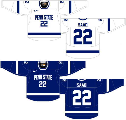
The jersey design for the NCAA era of Penn State hockey were announced today. Here are the pics:

The whites are very similar to Cornell's white home jerseys except with the Nittany Lion logo and block lettering. So, now only three schools will have similar white and striping patterns (Cornell, Miami, and Penn State).

Needless to say, I find the whites great. They were not what I would have chosen, but they are sleek and classic. I have mixed feelings about the blues, but I really like the Nittany Lion embroidered logo on the back and the fact that they have no name. I think the blues are growing on me while I am sold on the whites. What does anyone else think?
The whites are very similar to Cornell's white home jerseys except with the Nittany Lion logo and block lettering. So, now only three schools will have similar white and striping patterns (Cornell, Miami, and Penn State).
Needless to say, I find the whites great. They were not what I would have chosen, but they are sleek and classic. I have mixed feelings about the blues, but I really like the Nittany Lion embroidered logo on the back and the fact that they have no name. I think the blues are growing on me while I am sold on the whites. What does anyone else think?
amg424- Admin
- Posts : 124
Join date : 2012-04-02 -
Re: The Jersey Thread
![]() cagney Wed 12 Sep 2012, 12:07 pm
cagney Wed 12 Sep 2012, 12:07 pm
I always prefer a clean, simple jersey to a more elaborate one so I'm happy with these.
cagney- Posts : 7
Join date : 2012-04-18
Page 1 of 1
Permissions in this forum:
You cannot reply to topics in this forum|
|
|